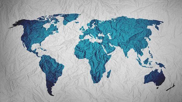
Why Does Greenland Look Bigger Than Africa - And India Smaller? The Mercator Projection Explained
Why is the Mercator map so distorted?
Mercator map showing Africa (left), and a map from the Equal Earth campaign (right). Composite: equal-earth, Getty Images
Gerardus Mercator (1512–94), a mathematician and engraver, created his famous map in 1569 to help sailors navigate the globe. The first version was a vast wall-sized mosaic of 18 sheets measuring 48 inches by 80 inches. By projecting the Earth onto a cylinder, Mercator devised a grid with longitudes and latitudes crossing at right angles.
The genius of his design was that straight lines on the map represented true compass directions, a breakthrough for navigation. Though it distorted landmasses, especially near the poles, the map revolutionised sea travel and by the 19th century became the standard for atlases and classrooms worldwide.
It was designed for navigation, ensuring sailors could plot straight-line courses across oceans. But this navigational convenience came at a cost: the projection distorts land size as it moves away from the equator.
When Mercator displayed the near-spherical Earth as a rectangle on a flat surface with the equator at the centre, it left large, confusing gaps near the poles. So, he stretched out the northern and southern ends of the globe to fill them - and thus produced a usable map.
However, as a result of this manoeuvre, areas closer to the poles - such as Canada, Russia, the United States, and Europe - appear bigger than they are. And Africa - which straddles the equator - looks smaller than it is.
Even tropical countries like India appear smaller than they actually are.
Regions near the poles, such as Greenland or northern Canada, appear vastly enlarged, while equatorial regions - including Africa, India and South America - are compressed.
This distortion leads to striking misperceptions. Africa, at 30.3 million square kilometres, is over 14 times larger than Greenland's 2.1 million square kilometres. Yet on most Mercator maps, Greenland, which is the size of the Democratic of Congo, appears bigger than the African continent.
How does this distortion affect Africa's image?For campaigners, the impact of the Mercator projection goes beyond geography. Selma Malika Haddadi, deputy chairwoman of the African Union's executive arm, told Reuters that the map fosters the impression of Africa as“marginal.”
Civil society groups like Africa No Filter and Speak Up Africa have launched the“Correct the Map” campaign, urging global organisations - including the BBC and the United Nations - to adopt more accurate alternatives such as the 2018 Equal Earth projection.
“It is more than geography, it's really about dignity and pride,” said Fara Ndiaye, co-founder of Speak Up Africa.“Maps shape how we see the world, and also how power is perceived.”
Why does Greenland look bigger than Africa?The explanation lies in latitude.
Distortion increases closer to the poles. Greenland, located near the Arctic Circle, is stretched unnaturally on the Mercator map, inflating its landmass visually. Africa, lying closer to the equator, suffers minimal distortion, meaning its size is comparatively diminished when viewed alongside northern territories.
As a result, a landmass with fewer than 60,000 people is made to look comparable to a continent of 1.5 billion.
How big is Africa compared to Greenland?The difference is staggering. Africa's landmass is about 30.3 million square kilometres - more than 14 times the size of Greenland, which covers just 2.1 million square kilometres.
This has long contributed to misconceptions about Africa's importance and size. In reality, Africa can easily contain the United States, China, India, Japan, and much of Europe combined.
Why does India look smaller than it really is?India is another victim of Mercator's distortion. Located near the equator, it shrinks in visual comparison with northern countries like Canada or Russia. This makes India appear smaller than it truly is, despite its vast landmass and population.
India covers 3.29 million square kilometres, yet on many school maps, it looks dwarfed by countries with far smaller actual areas.
Is this just about maps - or about power?Campaigners argue that the problem is not simply geographical. Maps shape narratives. By distorting landmasses of the Global South, the Mercator projection helped reinforce a Eurocentric worldview where Europe and the North appeared dominant.
As Selma Malika Haddadi of the African Union noted:“It might seem to be just a map, but in reality, it is not.”
How are perceptions changing today?Alternatives such as the 2018 Equal Earth projection are gaining momentum. Unlike the Mercator, the Equal Earth projection preserves the proportional size of continents. On this map, Africa appears in its true scale, dwarfing Europe and North America.
As Fara Ndiaye of Speak Up Africa put it:“By correcting the map, we also correct the global narrative about Africa.”
What happens next?The African Union is expected to formalise its decision to adopt the Equal Earth projection at its leaders' summit in Ethiopia in February. Campaigners hope this will set a precedent, pushing international institutions to replace the centuries-old Mercator with area-accurate projections that better reflect global realities.
The AU has also tied the initiative to its 2025 theme,“Justice for Africans and people of African descent through reparations,” framing the campaign as part of a broader project to dismantle colonial-era narratives.
Legal Disclaimer:
MENAFN provides the
information “as is” without warranty of any kind. We do not accept
any responsibility or liability for the accuracy, content, images,
videos, licenses, completeness, legality, or reliability of the information
contained in this article. If you have any complaints or copyright
issues related to this article, kindly contact the provider above.


Comments
No comment